Just launched: Moov Drops
If you’ve ever created an onboarding flow, you know how complicated it can get. It seems simple at first, but handling every failure state is tedious. Yet designing a solution for every scenario and edge case is paramount to a great user experience.
As a designer at Moov, I think about these user journeys a lot. Our customers focus on the experience after onboarding, linking a card, or adding a bank account. But what about everything that comes before the rest of the product? You want those steps to be just as fast and smooth as everything else. That’s why we sweat the details so that onboarding is as eloquent as the rest of your software.
Share thisWe want you to be able to design, embed, and launch beautiful payment experiences inside your product insanely fast so you can get back to what you love—developing new features, not building onboarding or learning about payments.
Today, I’m excited to help you do just that: accelerate your launch with our powerful UI building blocks. With Moov Drops, time to market has been decreased to minutes, allowing you to focus on your unique business value.
Introducing Moov Drops
Moov Drops are pre-built UI components that are ready to use on their own, saving you countless design and development hours. Drops empower you to launch secure onboarding and payment experiences in minutes instead of months. Simply pick the element you need, use our defaults, or customize it to match your brand perfectly.

Onboarding simplified
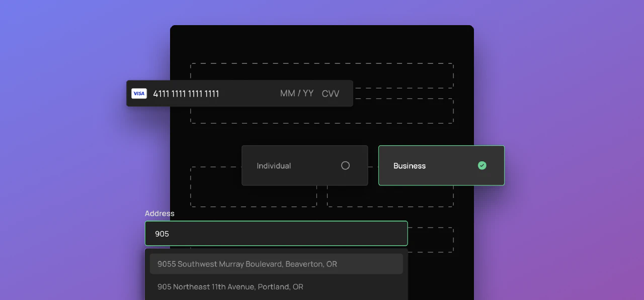
Onboard and verify your customers quickly with the onboarding element. Specify the capabilities you need, determine the required inputs, and customize the entire UI. We carefully considered all aspects of a great experience, so there’s nothing left for you to do except plug in the drop and launch.

Rather than create miscellaneous components, we wanted to provide a complete payment experience while still giving you the flexibility to use individual pieces as you wish. Here’s what we did to make that happen:
- The onboarding drop automatically flows into the payment method element where users can link their bank accounts or cards.
- The payment method element can be used independently, if you don’t need to onboard.
- Just accepting cards? No problem, we’ve made the card link available for standalone use.
Whether you’re using the full onboarding drop or individual elements, we hope these components save your team valuable time.
Built-in moments of delight
Everything from error handling to form shortening to address auto-complete is built-in and ready to go. These details make for a smooth experience and come with no lift on your side, which is helpful if you don’t have the development time to build these little details on your own. When we say we thought of everything, we thought of everything, so you don’t have to. Drop a component in, and then get back to building new features for your product.

Customize to your heart’s content
Do you ever feel like you’re slapping someone else’s experience on top of your own? With Moov Drops, we’ve made it easy to customize the UI so you stay in control. You can start with our easy-to-use themes. Each comes pre-set with straightforward color palettes for a great foundation. Next, change a few hex values to get the exact feel you want. Developers can also make additional changes by editing CSS variables for further customization. No matter what you tweak, you can use as many Drops as needed and only adjust the styles once.

More dropping soon
One thing is certain: there are numerous use cases for drop-in components and we’ve only begun to scratch the surface. We’re working hard to bring you more Drops, and I can’t wait to share them with you! In the meantime, subscribe to our newsletter so you’ll be the first to know when they land.


